Getting Started — for users
This quick start guide will help you understand:
- How information is organized
- How to log in
- How to work with your dashboard
- How to navigate the U.I.
- How to change your preferences
- How to create your first project
- How to work with the gantt chart
- How to report progress on tasks
- How to log time
- How to track projects
- How to run reports
- How to get help
A. How information is organized
You can create projects, tasks, risks, issues, change requests, etc. You can also log time and expenses, upload files, and enter comments. Let’s see how they are all organized.
Organization
│
├── Workspace 1 (e.g. Engineering)
│   │
│   ├── Project 1.1
│   │   │
│   │   ├── Tasks
│   │   │   │
│   │   │   ├── Subtasks
│   │   │   ├── Time Logs
│   │   │   ├── Expenses
│   │   │   ├── Updates
│   │   │   └── Files
│   │   │
│   │   ├── Discussions
│   │   │
│   │   ├── Risks (Custom App)
│   │   │   │
│   │   │   ├── Time Logs
│   │   │   ├── Updates
│   │   │   └── Files
│   │   │
│   │   ├── Issues (Custom App)
│   │   │   │
│   │   │   ├── Time Logs
│   │   │   ├── Updates
│   │   │   └── Files
│   │   │
│   │   └── Files
│   │
│   ├── Project 1.2
│   │   ...
│   └── Project 1.N
│
├── Workspace 2 (e.g. Marketing)
│   │
│   ├── Project 2.1
│   │   ...
│   └── Project 2.N
│
└── Workspace M (e.g. Sales)
    │
    ├── Project M.1
    │   ...
    └── Project M.N
B. How to log in
When user accounts are created, they are notified via email of their username, password and the link to log in. Consult that email to obtain your username and password. After logging in, you should change your password.
URL: https://celoxis.com

Contact your system administrator or refer the email in your inbox as mentioned earlier.
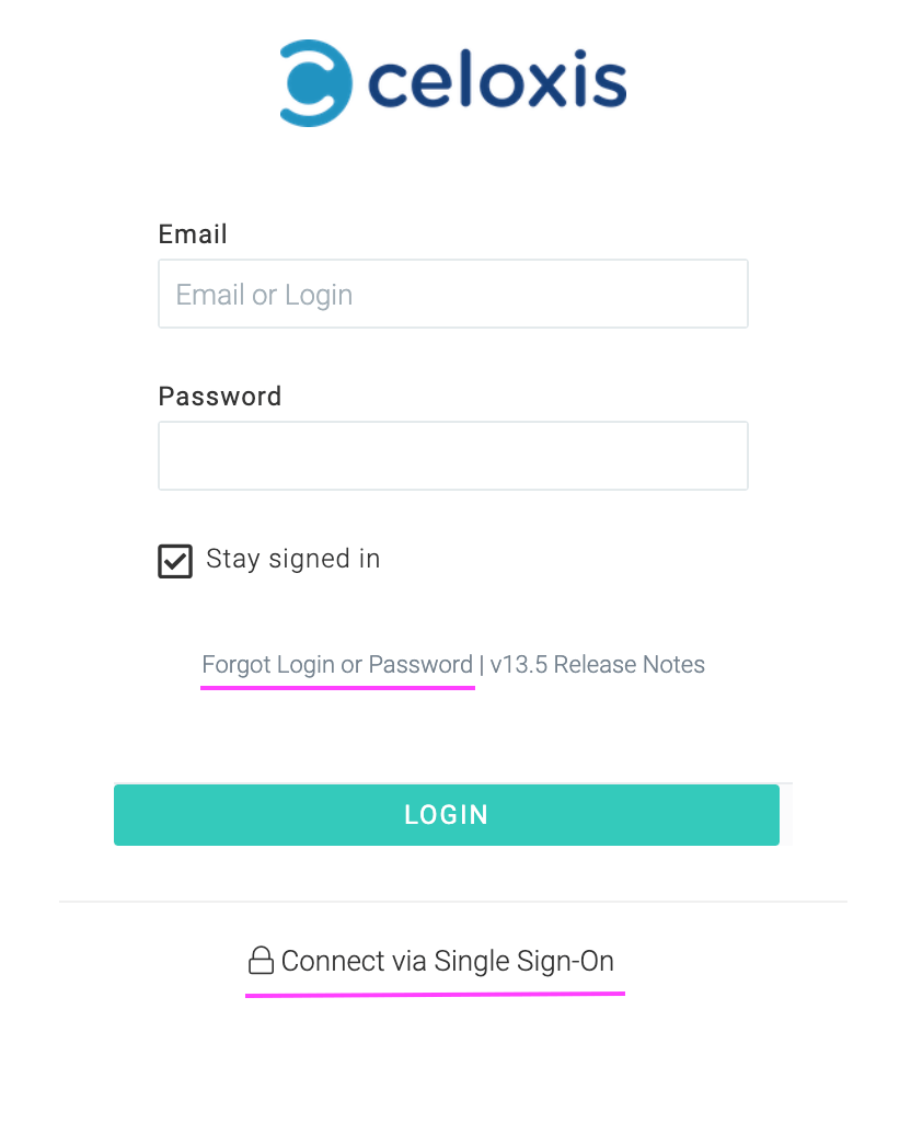
As you can see the login screen is straightforward. If your organization uses single sign-on, then click on the SSO link highlighted in the image.
C. Dashboard
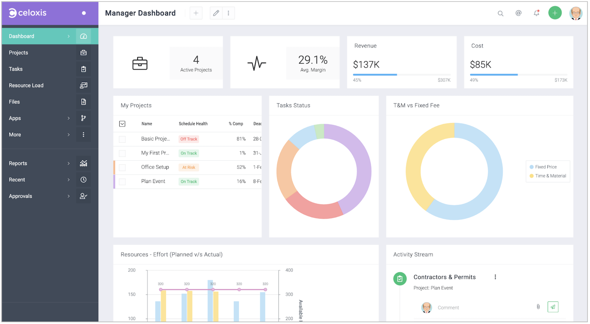
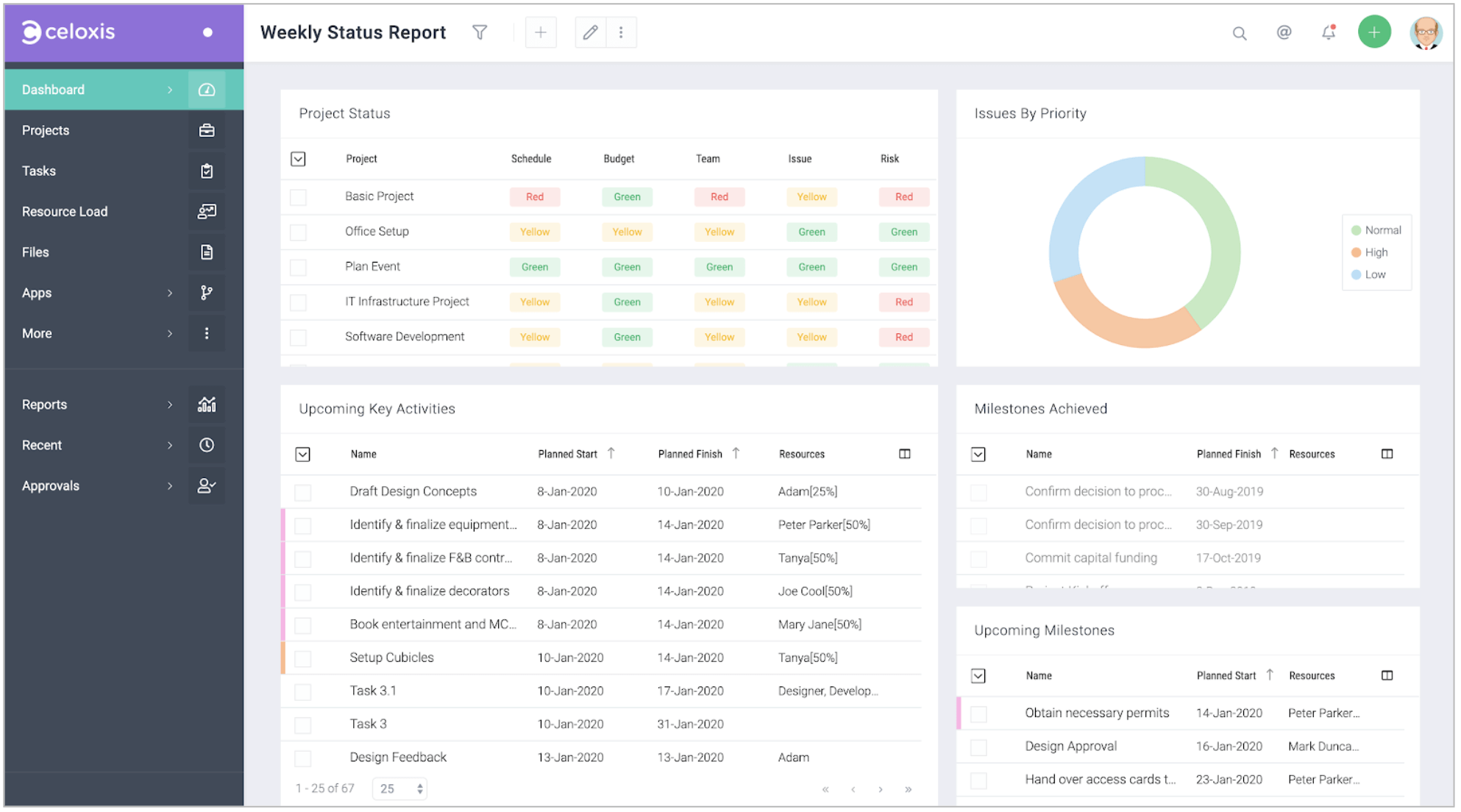
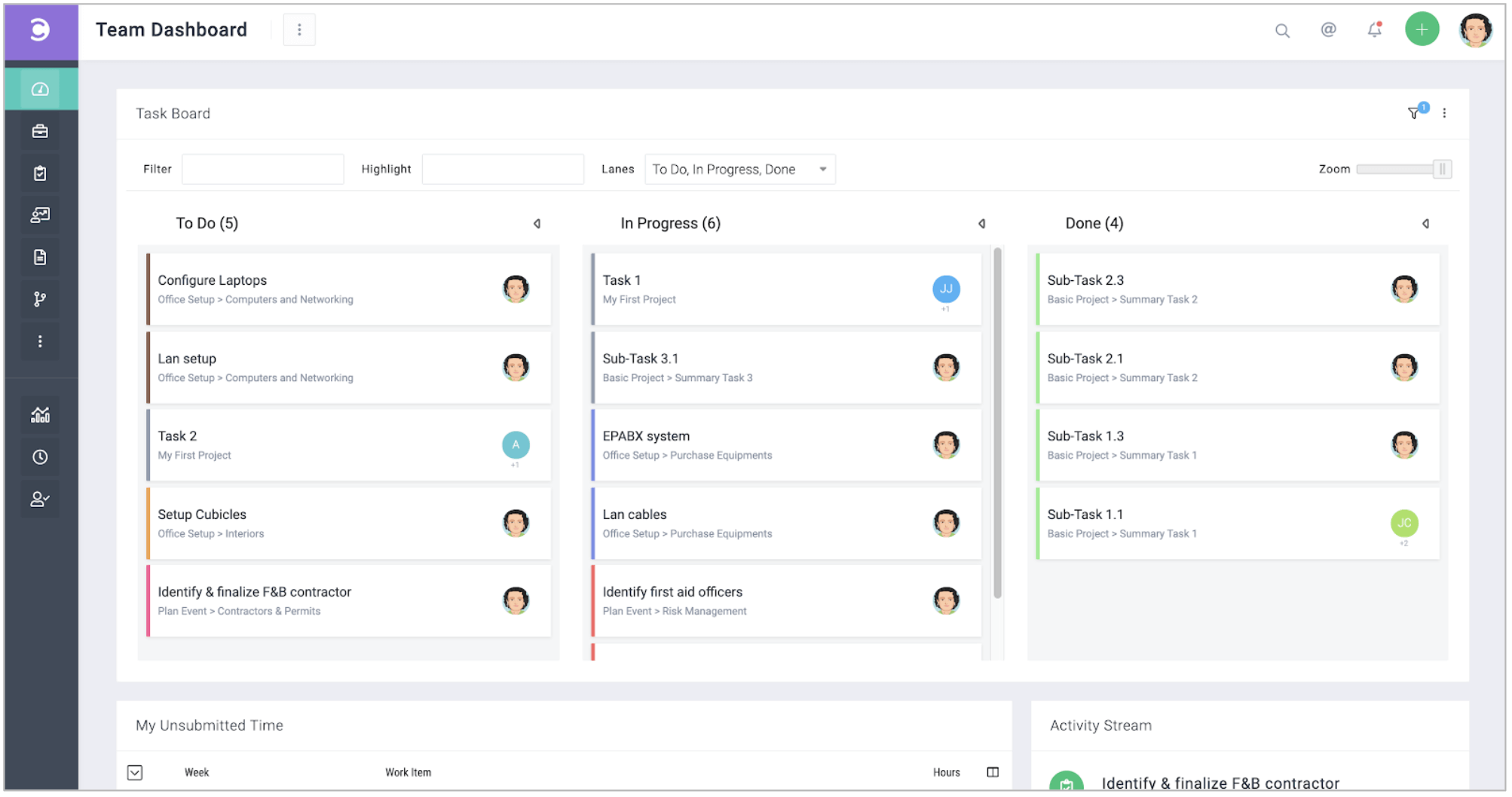
Your account will be pre-populated with multiple dashboards that we think are useful. Use them as is or as a starting point for your customizations.
There are 5 things that you should know:
1. Multiple Dashboards
You can create multiple dashboards to suit your working style. You can create different dashboards based on role – for example a dashboard each for project manager, team member, resource manager, PMO director, etc. You can even create different dashboards based on function – for example a dashboard each for planning, tracking, QA, resource utilization, etc.
Multiple dashboards can be assigned to one user.
2. Customizing Dashboards
You can customize the widgets, layouts, columns, filters, grouping and much more.
In the following example, a widget is deleted and a new widget is added and resized.
3. Performing Actions on Dashboards
You should be able to do most of your work from your dashboards.
In the following example, a manager drills down a pie chart to list all overdue tasks and requests an update from the assignees.
4. Sharing Dashboards
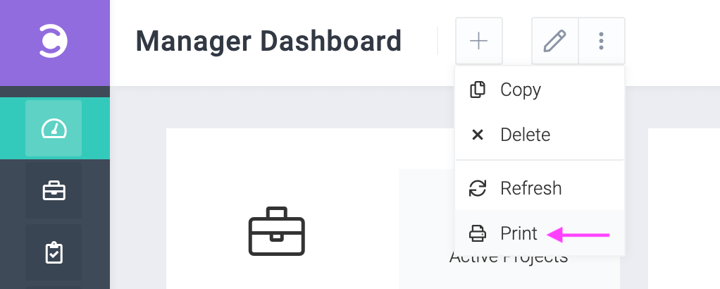
Dashboards can be exported to PDF that you can send via email.
5. Scheduling Dashboards
You can schedule dashboards to be sent via email at scheduled times.
Click on next to the dashboard name and then click on tab to enter your schedule details and recipients.
D. Navigating the User Interface
The Celoxis User Interface (UI) is consistent and predictable. This means that if you understand how one page works, you will understand how 90% of other pages work.
We shall now look at the basic elements of the user interface:
- The Top Menu
- The Side Menu
- The Recent Items Menu
- Starred Reports
- A Typical Page

1. The Top Menu (or Top Bar)
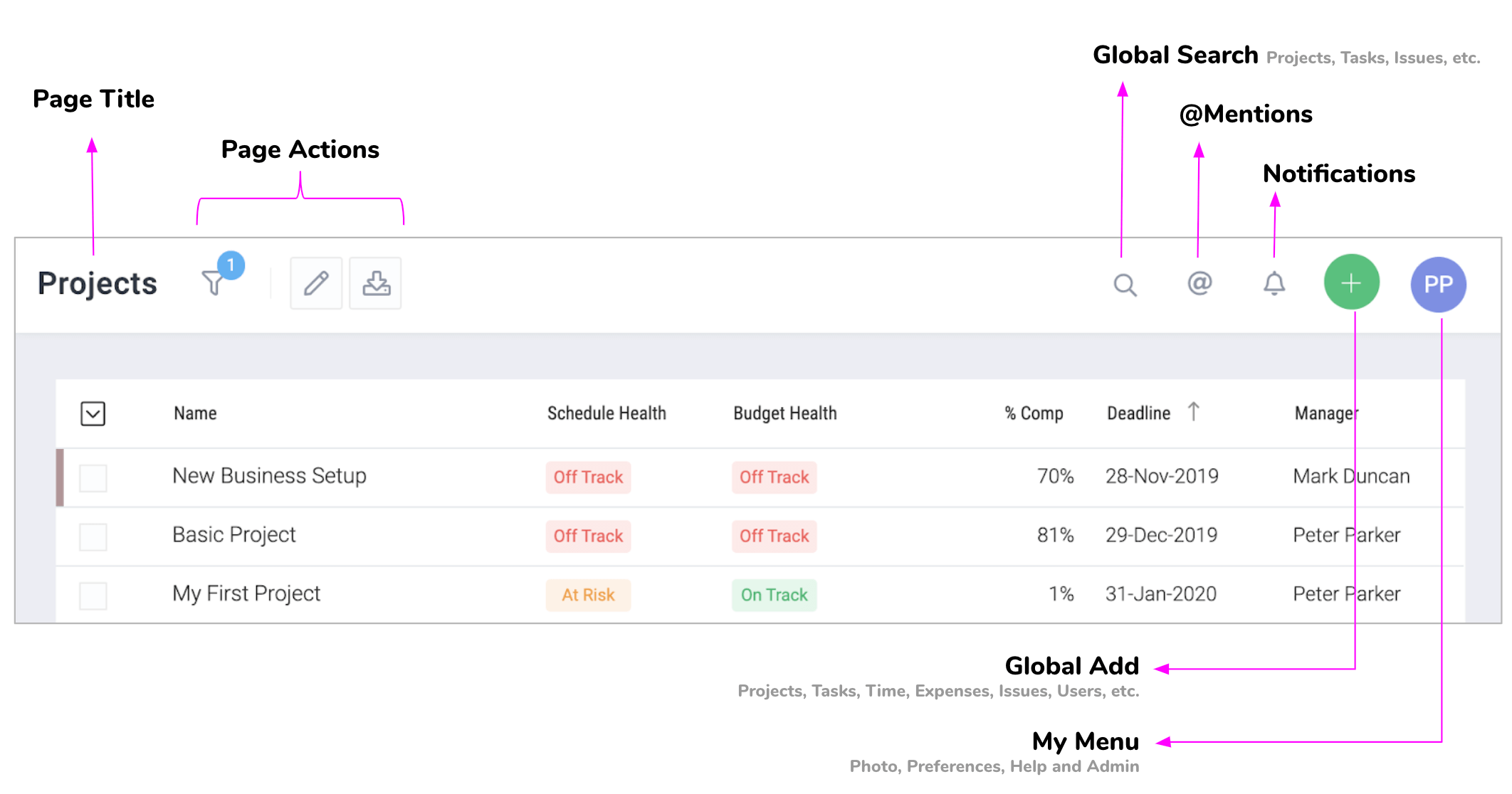
The left hand side elements of the top menu i.e. the page title and actions change with every page while the right hand side elements starting with the search icon do not. The following image describes the elements in the top menu.
The Add Menu
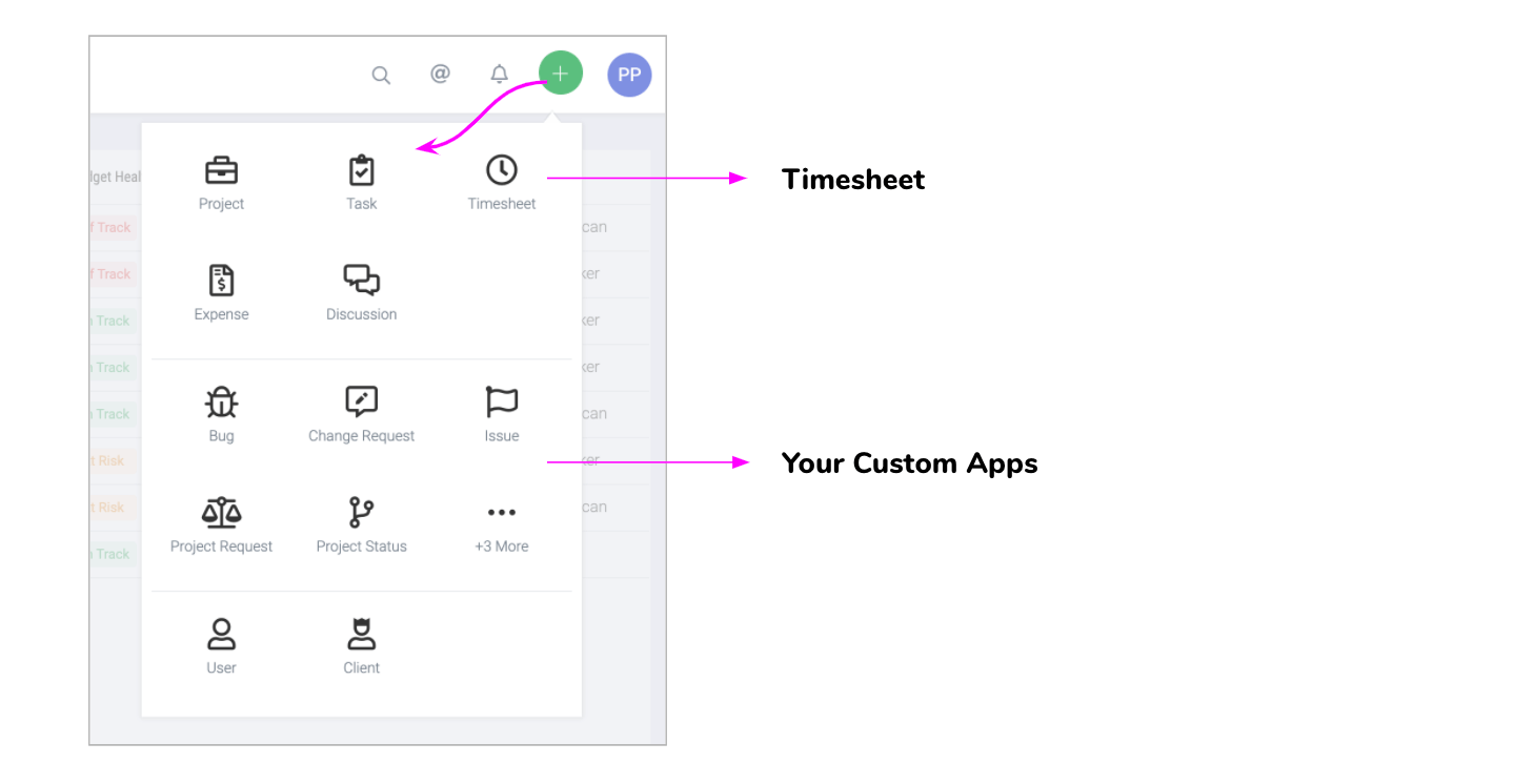
The add button is always available on all pages and can be used to add projects, tasks, issues, risks, users and more as show below. You can quickly jump to the timesheet by clicking on the timesheet icon.
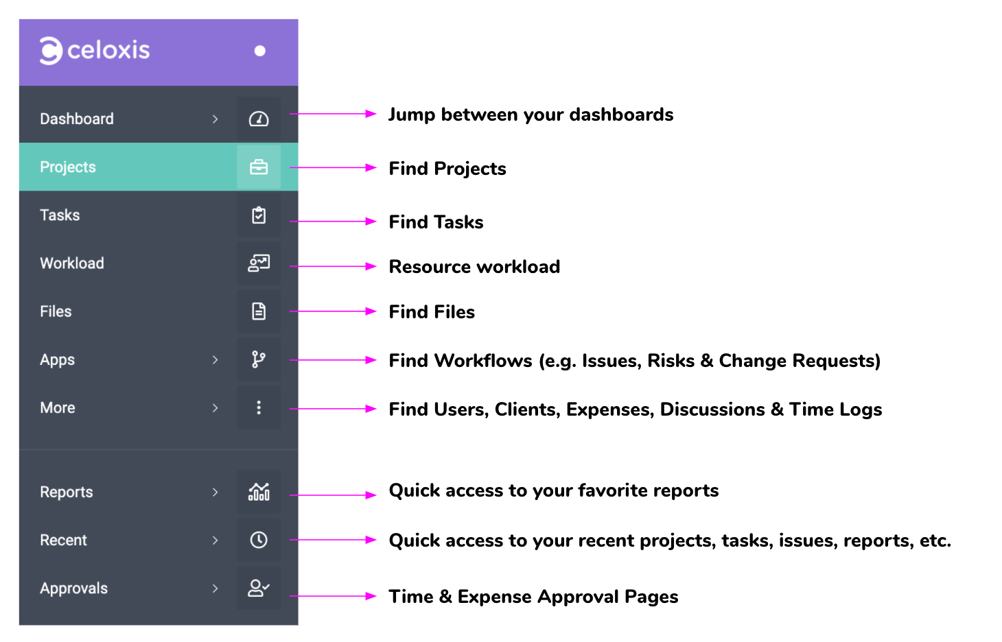
2. The Sidebar (or Main Menu)
The sidebar is used to navigate to different pages as shown below.
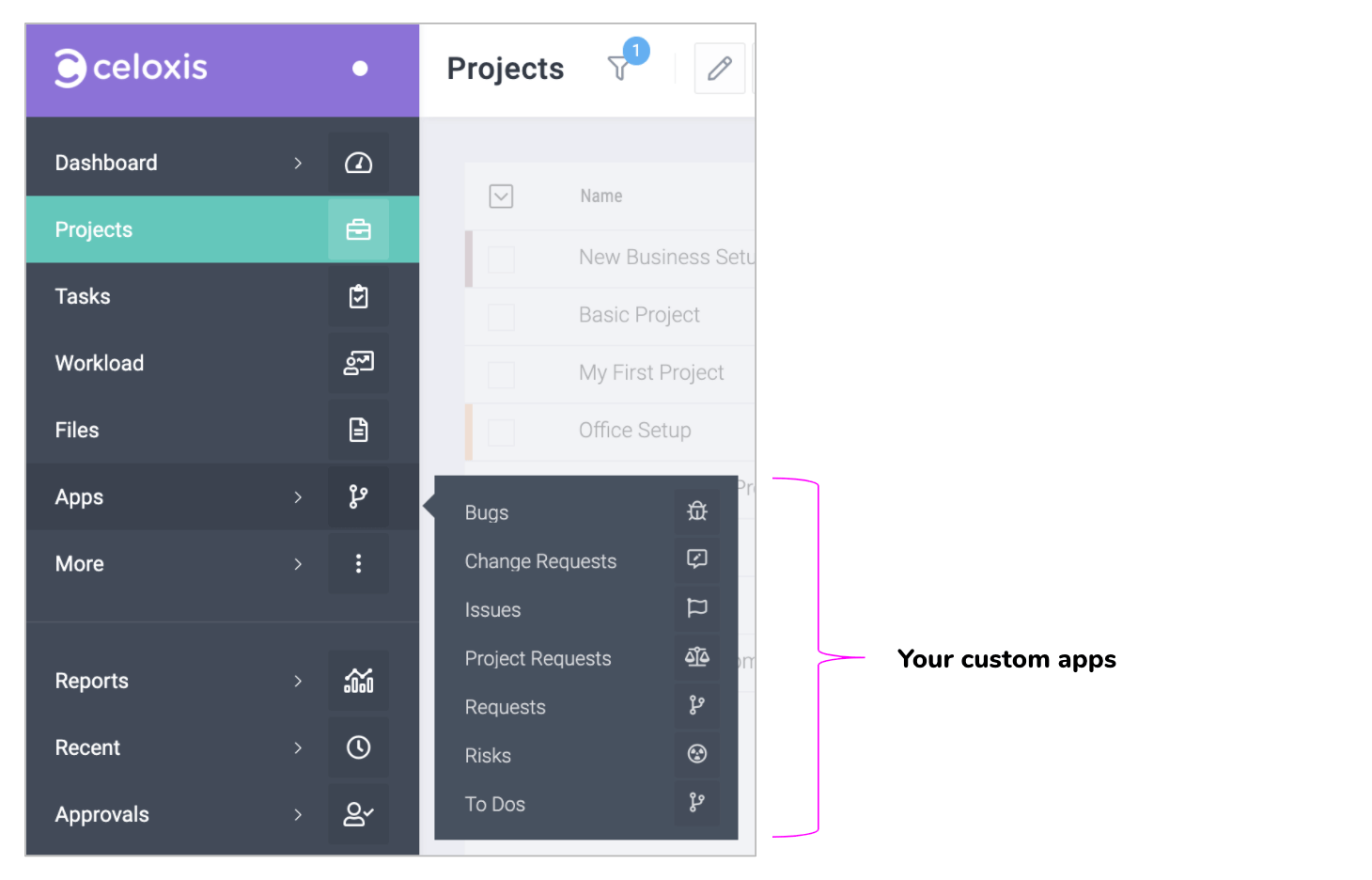
Sidebar > Apps Menu
The Apps menu is the way to go to lists of your custom apps. In the following example, clicking on Issues will take you to the list of issues.
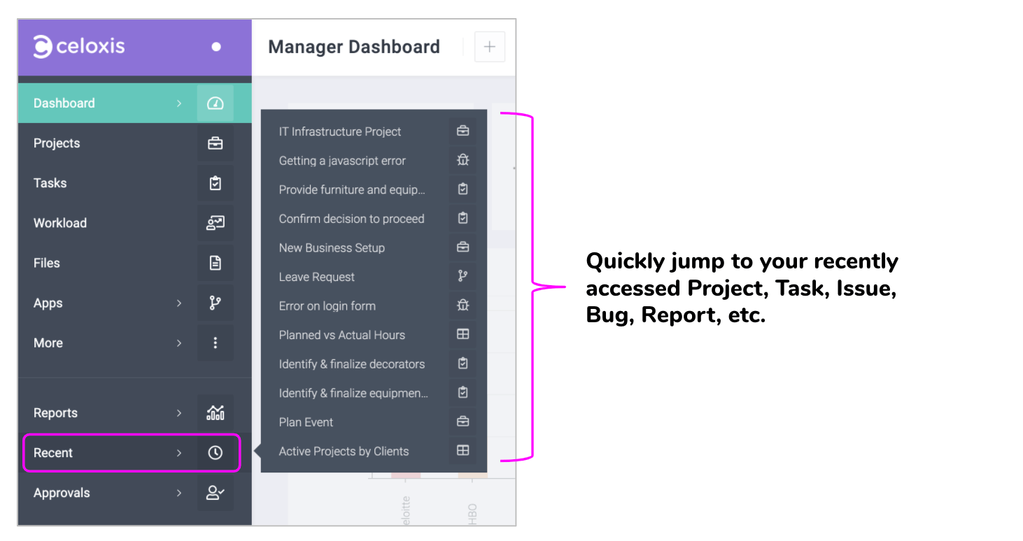
3. The Recent Items Menu
This menu is a great time saver. It lets you quickly jump to your recently accessed Project, Task, Issue, Bug, Report, etc.
4. Starred Reports
If you use a report frequently then mark it as favorite by clicking on the star icon in the report. Once done, this report will start appearing in your Reports menu.
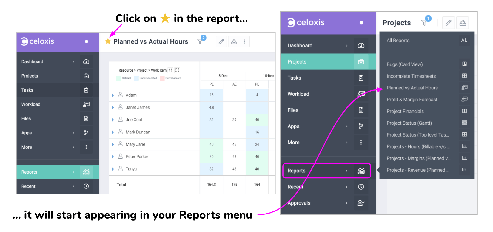
In the above example, clicking on the star for the report X makes it available in the Reports menu.
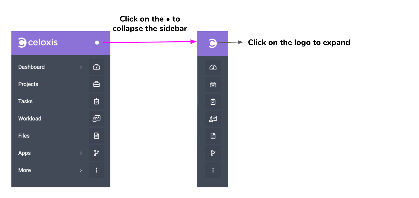
Tip: Get more screen real-estate by clicking on the
5. A Typical Page
Most pages will have the same structure as the example below.
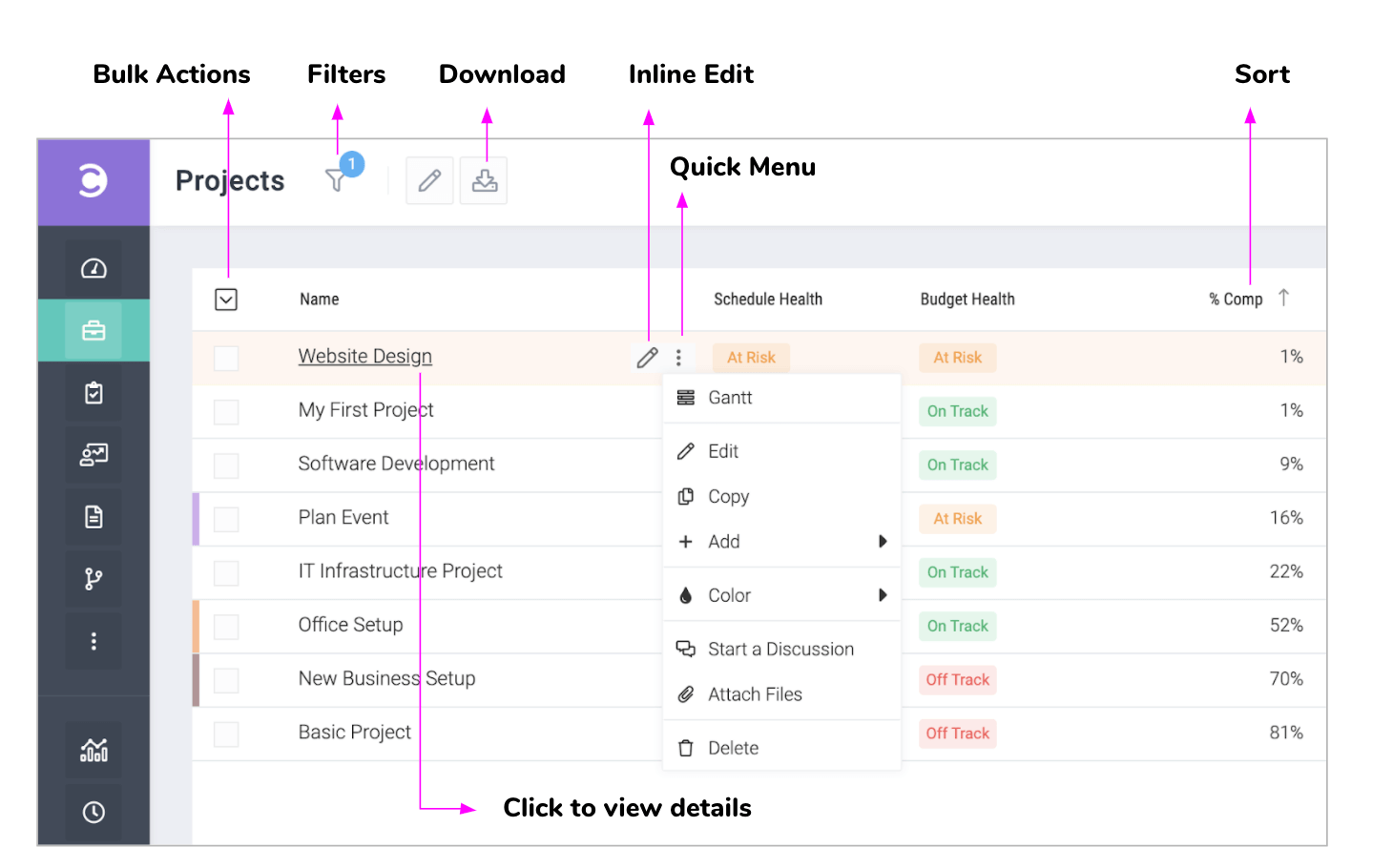
- Bulk Actions
- Select multiple items in the list and click on this button to perform actions on the selected list.
- Filters
- Click to change the filters
- Download
- Let's you download the report in multiple formats
- Inline Edit
- Click to edit the value right there without opening forms.
- Quick Menu
- A list of frequently performed actions on a list item. E.g. open the Gantt chart for a project.
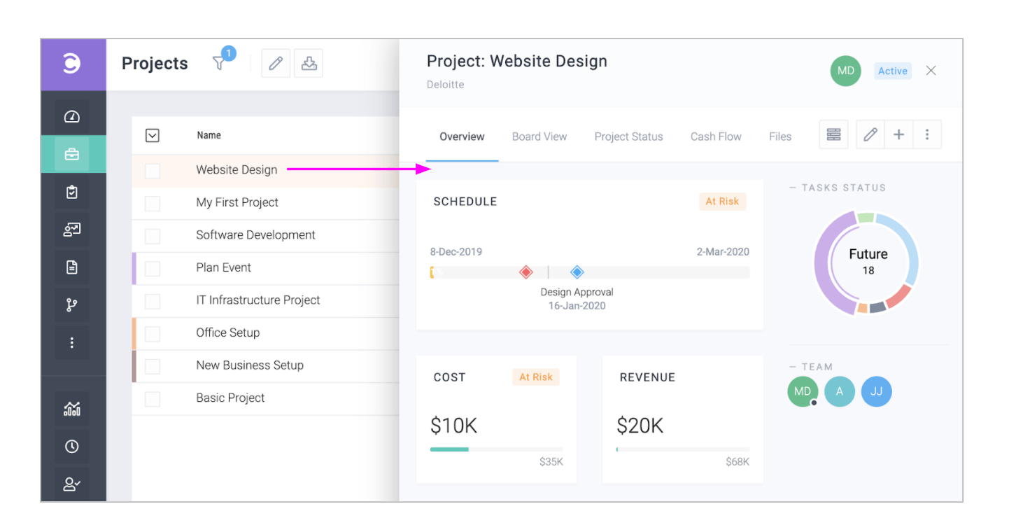
Viewing an item like project, task, issue or a custom app item.
Clicking on an item's name will open its panel. In the following example, we click on a project to view it.
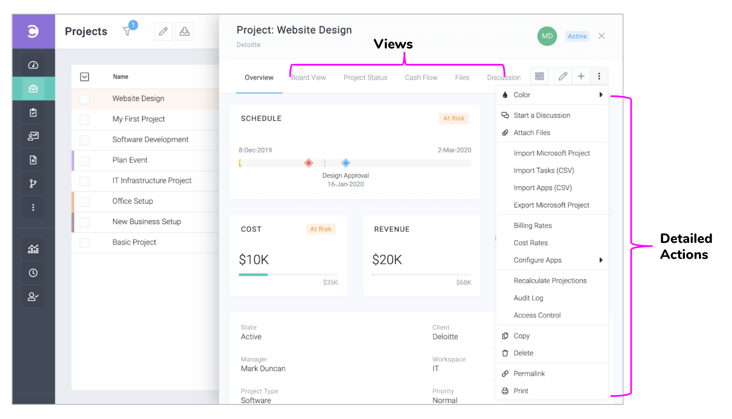
The Project Panel
The panels have tabs so you can quickly view associated items like tasks, files, risks and even reports. Clicking on the icon will reveal a comprehensive action menu like shown below. Panels for tasks, issues etc are organized similarly.
E. Changing your preferences
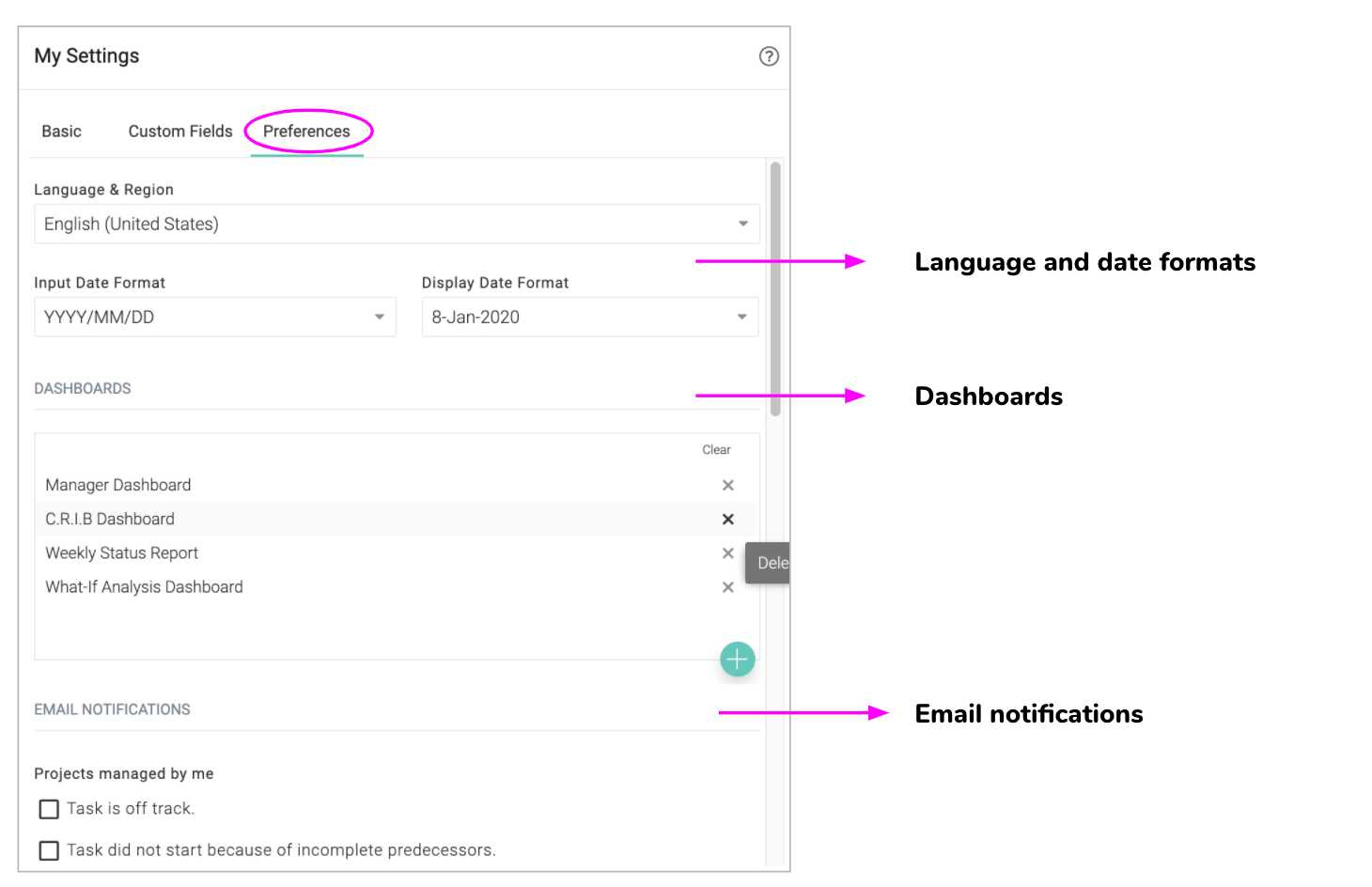
Click Top Menu ▸ ▸
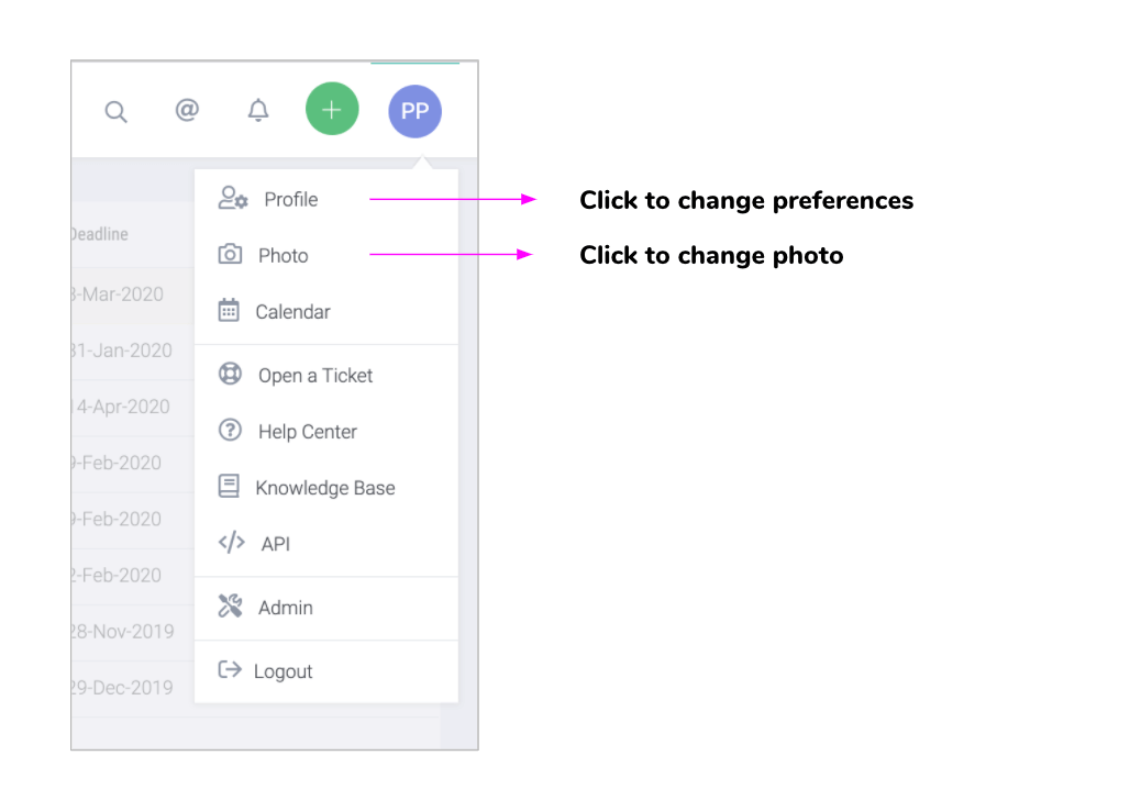
Click on the tab to change your language, date formats, email notification options and other preferences.
F. Creating your first project
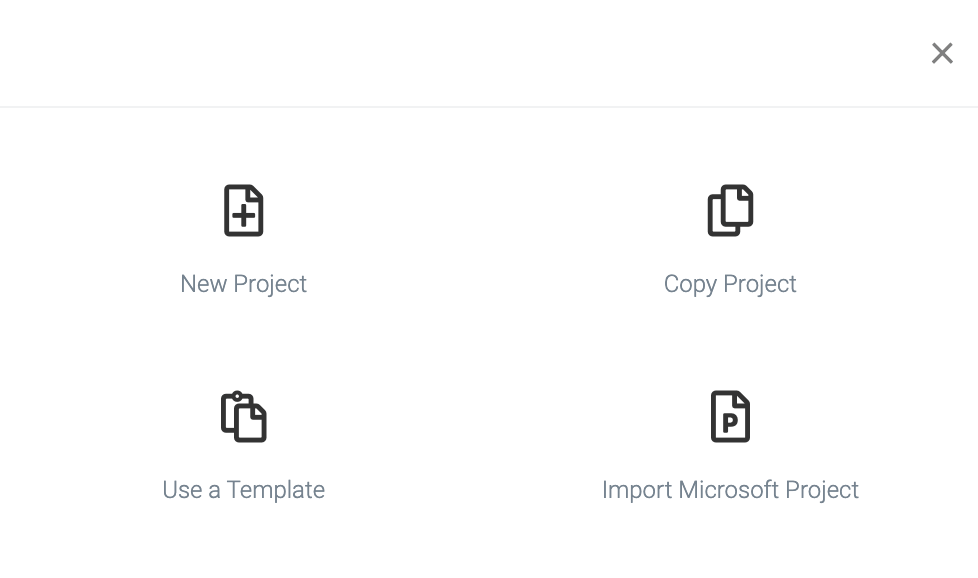
Click on Top Menu ▸ ▸ Project to add a project. You will be presented with a few options as shown below. If you have Microsoft Project files, you can import those or you can start with a blank project.
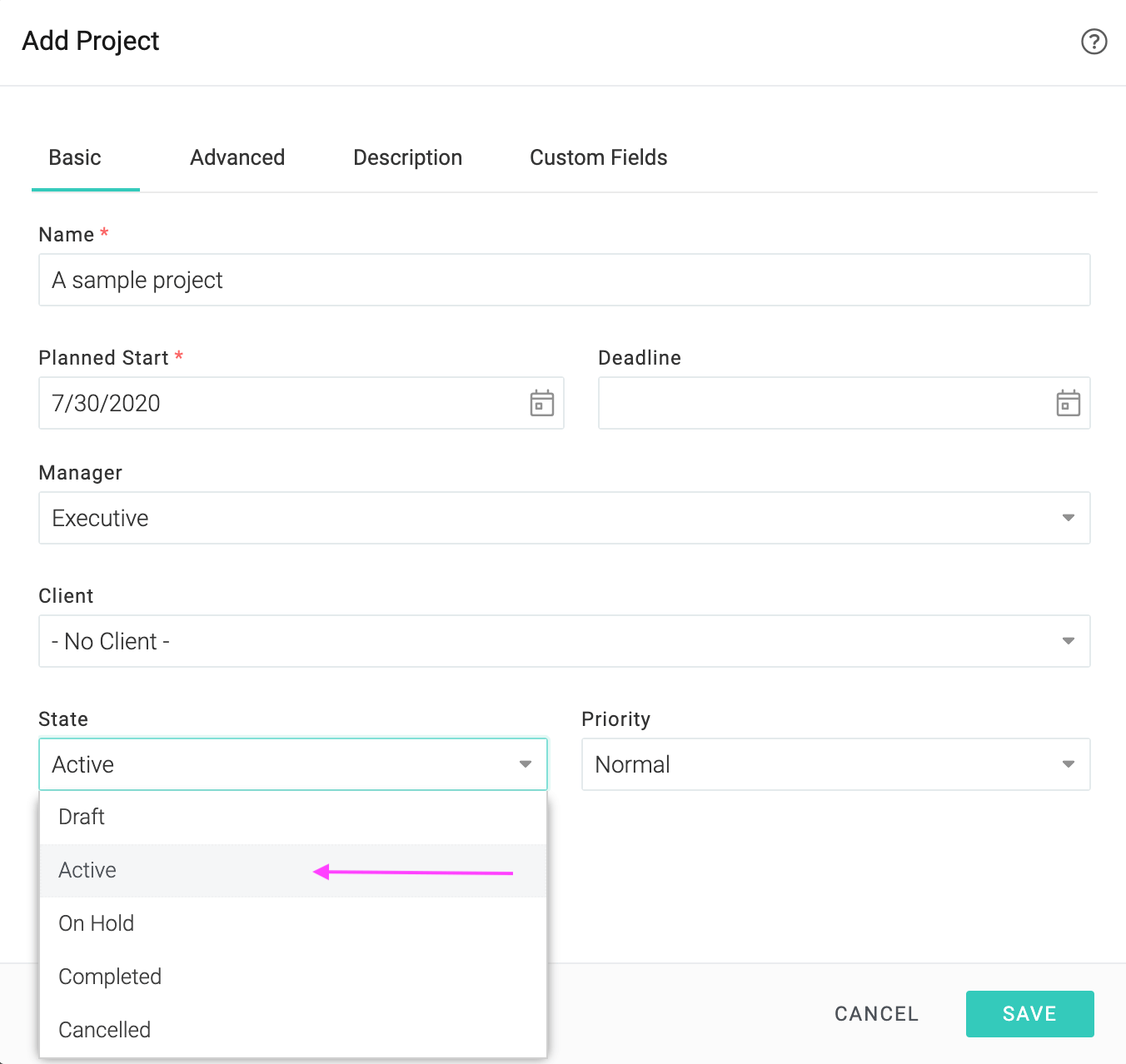
Activate your project
Mark this project as active which will indicate to the system that this progress is underway. This will enable email notifications and color indicators for this project and you shall get a better experience of the software's capabilities.
G. Gantt Chart
Click on on the project's panel to open the Gantt chart.

The following video highlights some of the important capabilities of the gantt chart like:
- Inline editing
- Drag-n-drop for changing task schedule, moving tasks and adding dependencies
- Adding multiple tasks quickly
- Assigning resources to tasks
- Identifying tasks with overloaded resources with the icon
- Selecting multiple tasks and right-clicking to perform actions on them
- Viewing critical path
H. Reporting progress on tasks
Team members can report progress on tasks from their dashboard.
Reporting progress on multiple tasks at once
Select the tasks to report on, click on the icon and choose the appropriate action. The option can be used to indicate that things are progressing as per the plan.
Reporting detailed progress on a single task
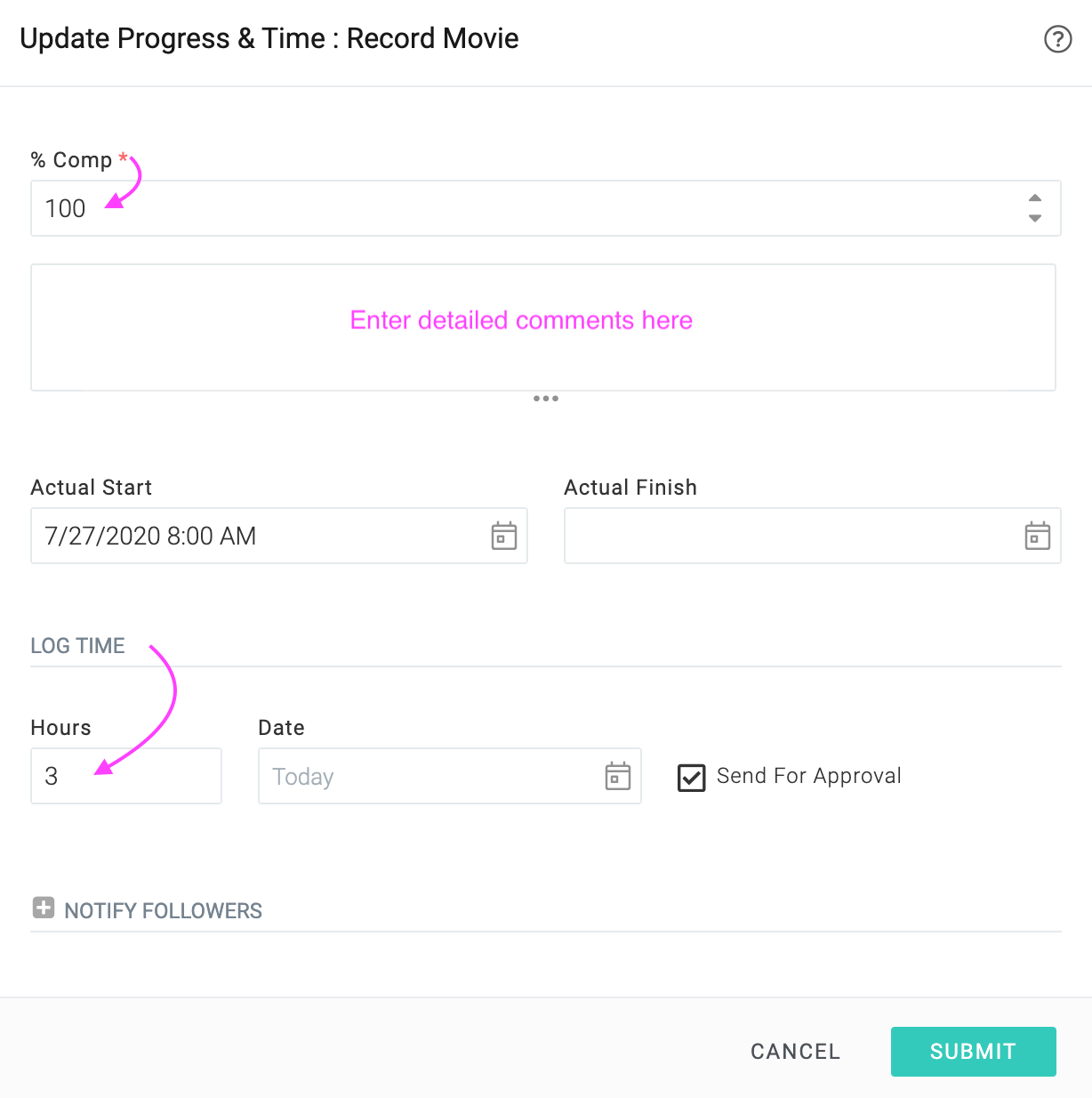
You can enter a detailed update and even log time at the same time using the action as shown below.
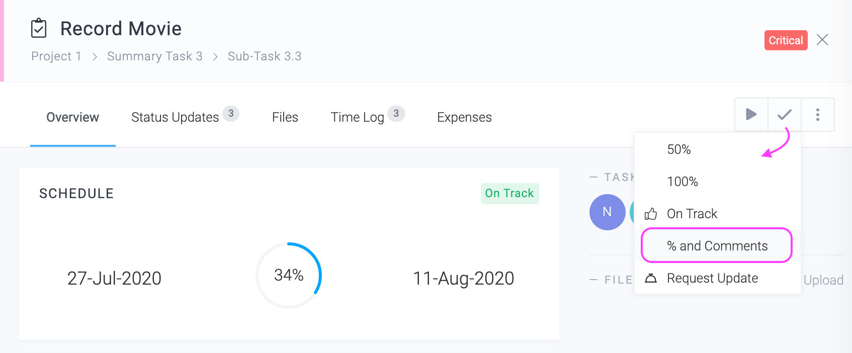
This will open a form like this:
I. Filling Timesheets
In the last section, we have seen how to log time on a specific task while updating its progress. We shall now look at logging time via the weekly screen.
To open your weekly timesheet click Top Menu ▸ ▸ Timesheet.
You can log time on tasks as well as non project time on the weekly timesheet. While logging time, you can also update task progress.
J. Tracking Projects
As team members report progress on their tasks, the system automatically calculates the estimated completion dates and costs of tasks and projects. This is indicated using RAG indicators.
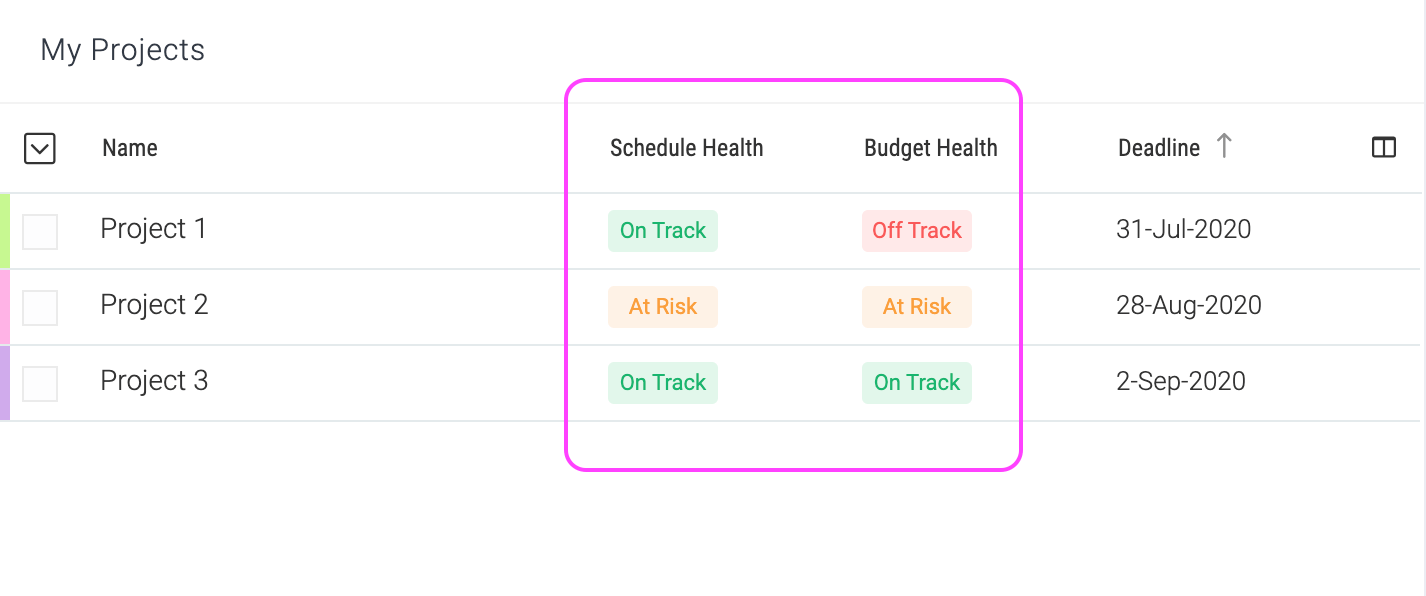
The Project Manager dashboard is a great place to track projects. You can customize the columns in list widgets, add chart widgets and drill-down into problem areas quickly. See the dashboards section of this document for more information.
Tracking a single project
When you click on a project, a panel will open. This panel will have a lot of interesting tracking information about the schedule, cost, revenue and even identify high priority items in issues, change requests etc.
You can also click on the various tabs to get various reports for a project. A sample is shown below. All tabs are fully customizable and you can add, customize or delete tabs as per your requirements.
K. Reporting
Celoxis has one of the most sophisticated reporting engines in the industry. We provide a number of pre-built reports that you can use as-is or as a starting point for building your report. To go to reports, click ▸ Reports ▸ .
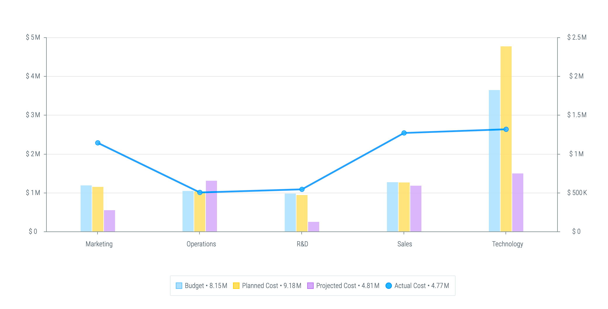
The sample reports shown below demonstrate the power of our reporting.
Budget Tracking
Cost Performance by Division
Cost S-Curve
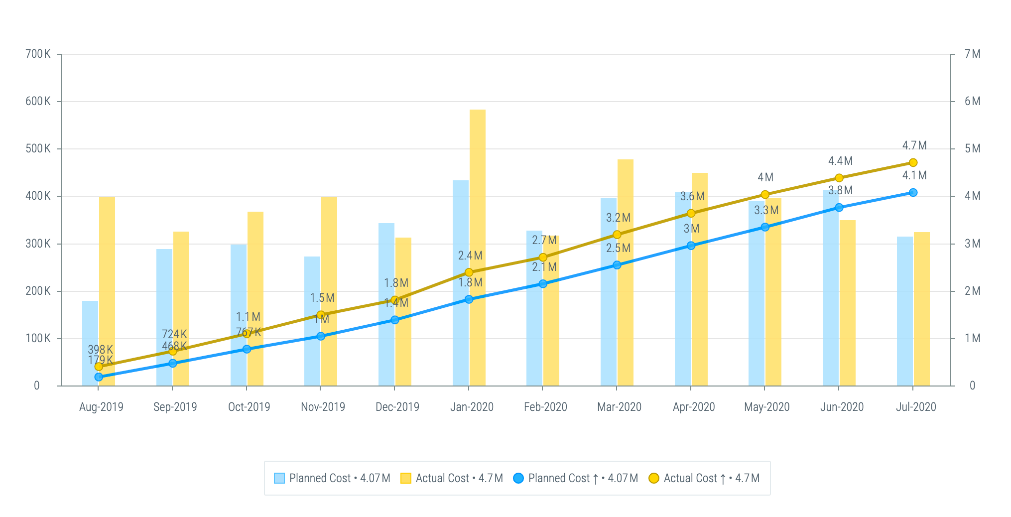
Monthly Cost Breakdown
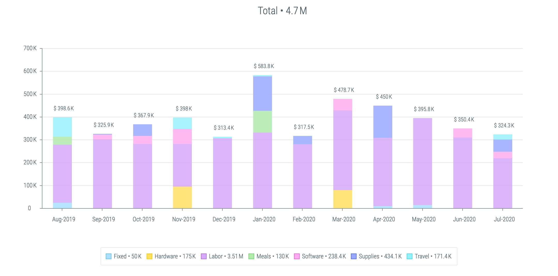
Revenue Performance by BU & Manager
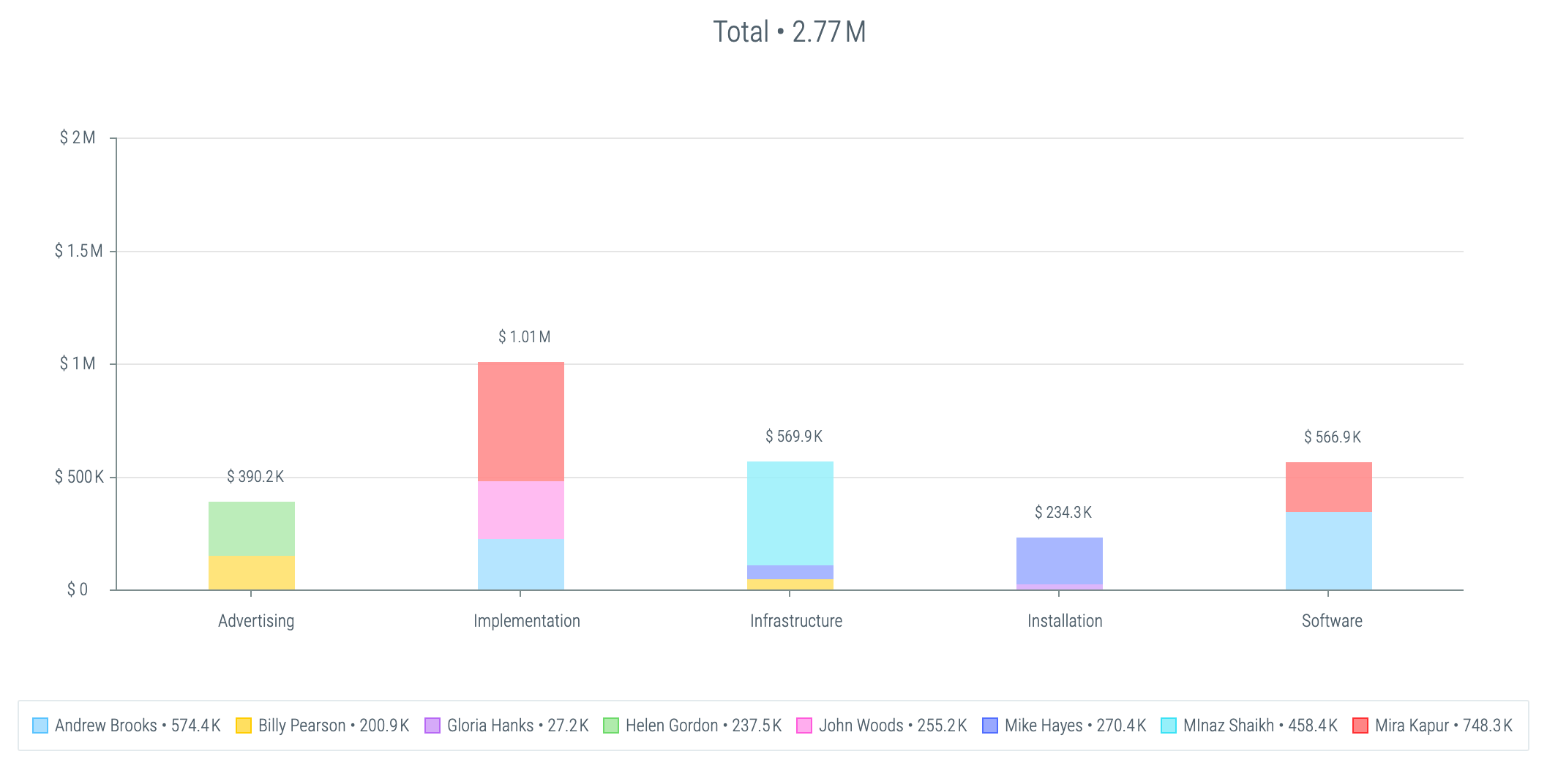
Product Roadmap
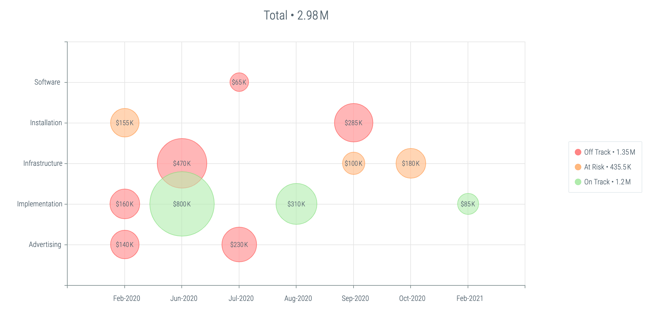
L. Getting Help
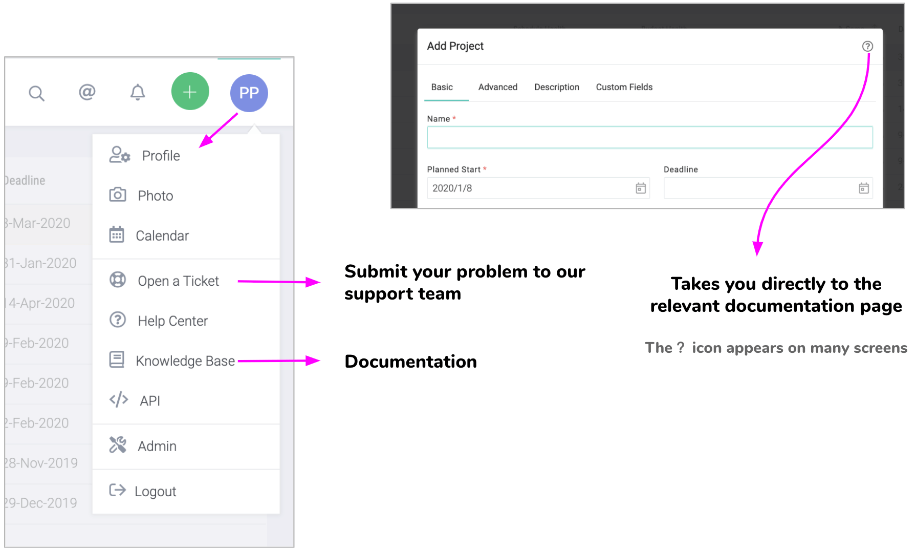
Context sensitive help is available on many pages that will directly take you to the documentation for that topic. Watch out of the icon as shown below.
To ask our support team a question or to go to the documentation portal, click on the appropriate items in Top Menu ▸ .
